Granite Playground
Live2.6× daily prompts · 3× unique users vs Granite 3.3
Overview
- Role & Responsibilities
- Hands-on design lead across end-to-end product design (User research, product strategy, UX design, interaction design, and prototyping)
- Team
- Designer × 3, Engineer × 5, PM × 1
- Period
- 2025 Q2
- Platform
- Web
What I did
- Defined user journey for the targeted users and enhanced their experience
- Owned the design direction for the landing page and sample prompts experience
- Guided interaction patterns and microinteraction quality across the product
Brief
Goal: increase Granite adoption. Evaluation is an early step, but trying Granite required setup or an IBM account.
We launched the Playground with Granite 4.0 so, for the first time, people could evaluate an IBM model directly in the browser without an IBM account.
Users
Enterprise Developers
- Evaluate Granite on real workloads
- Understand model capabilities
IBM Client Managers
- Find relevant industry examples
- Tailor demos for customers
Design challenge
How might one experience serve developers who need deep evaluation and client managers who need instant demos?
Process
User Research
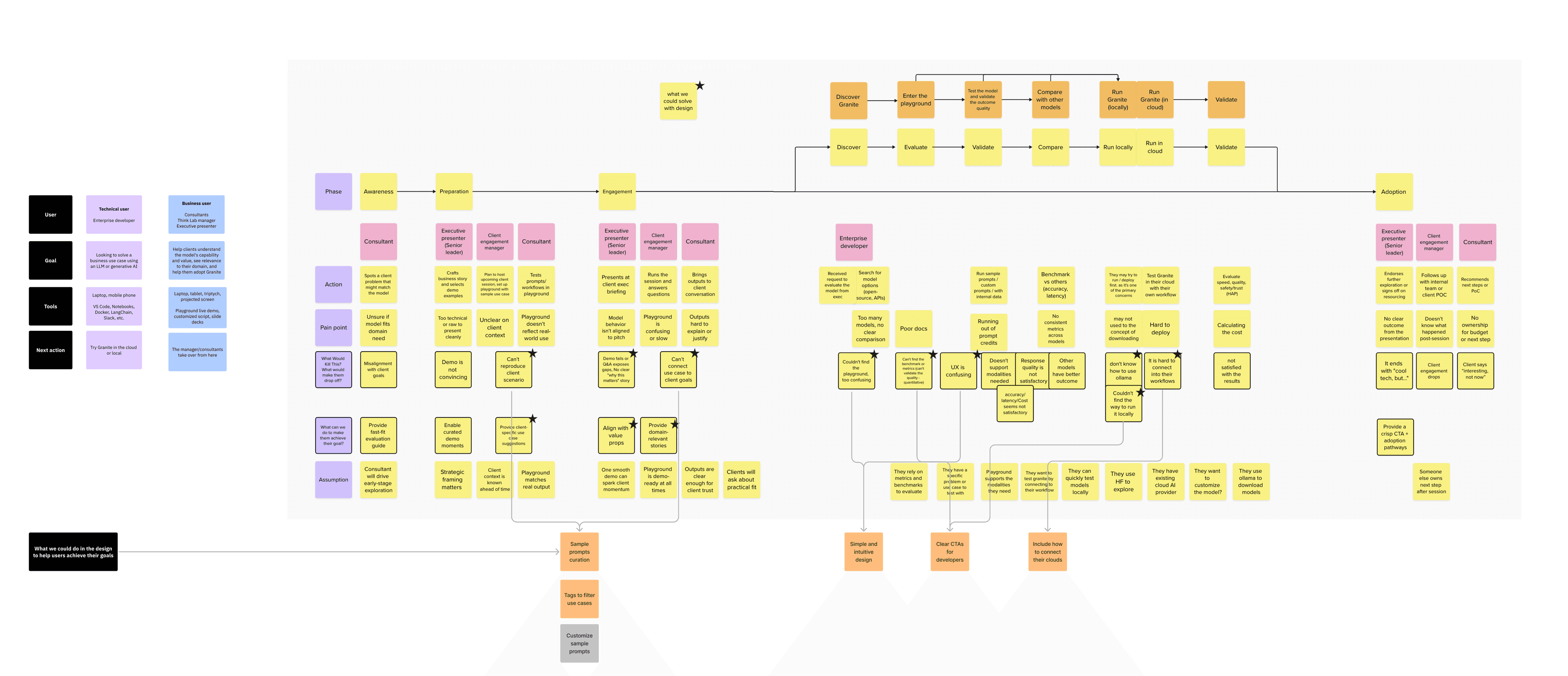
Mapping two journeys
Before designing screens, I mapped the end-to-end journey for both user groups to identify friction and design opportunities. Enterprise developers wanted to test Granite with their own use cases and understand the model's capabilities. IBM client managers needed examples they could tailor to the customers they were presenting to.
One shared entry point
I proposed a curated, filterable sample-prompt library that gave both groups one place to start while still helping each find what they needed. The experience also had to work within anonymous sessions and per-user token budgets without cutting people off mid-evaluation.
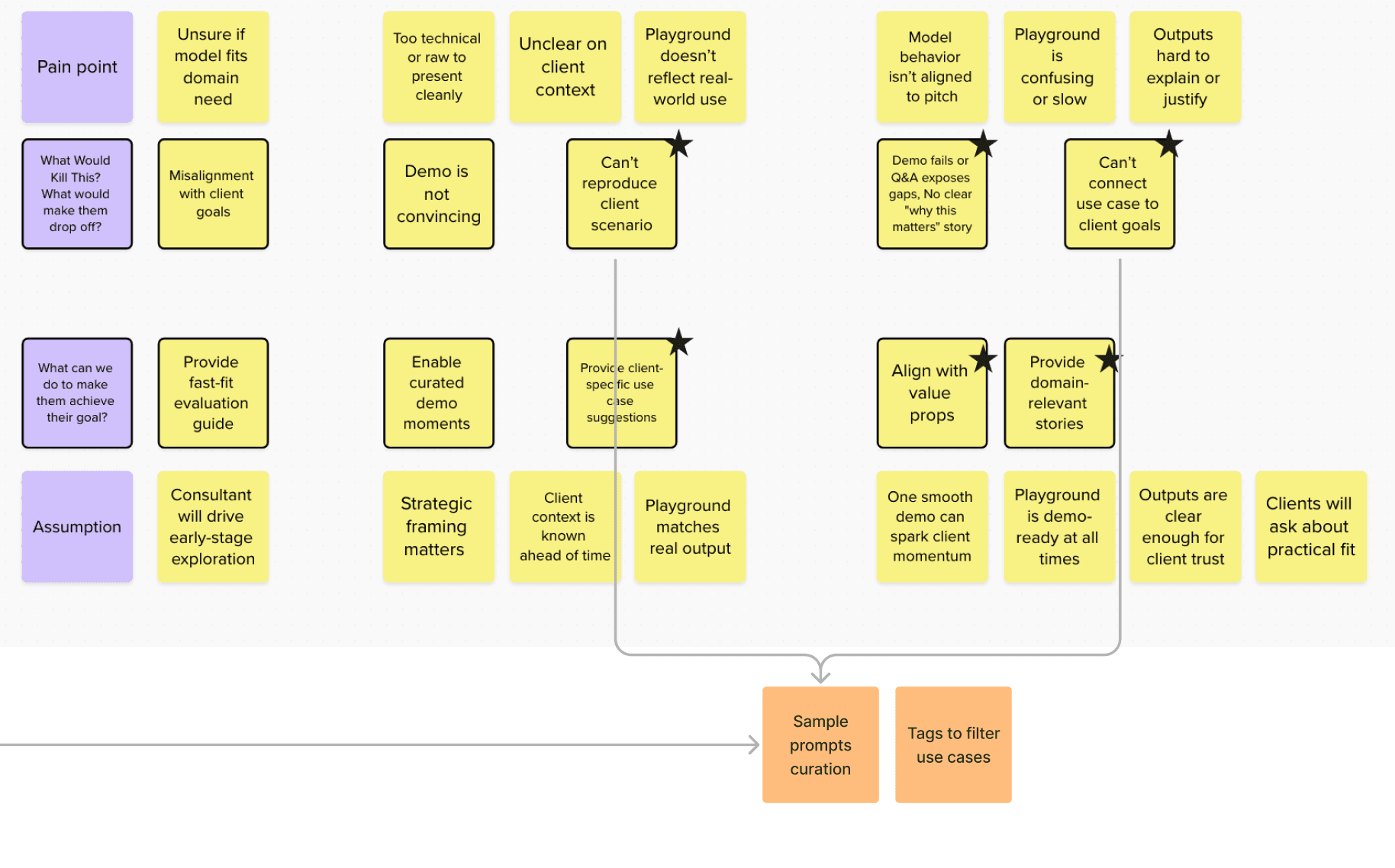
How do we serve both technical evaluators and business decision-makers in a single experience?
- Developers measure accuracy; managers measure business impact
- Generic prompts create skepticism; industry-specific ones build instant credibility
- Separate role-based onboarding paths
- Community-contributed prompts
A unified curated experience with enterprise-focused prompts, technical depth with business relevance.
Sample Prompts: The Front Door
A useful place to start
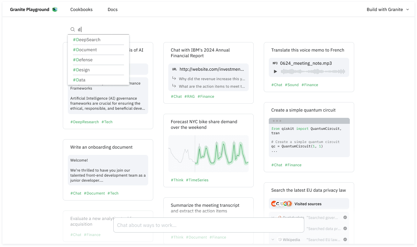
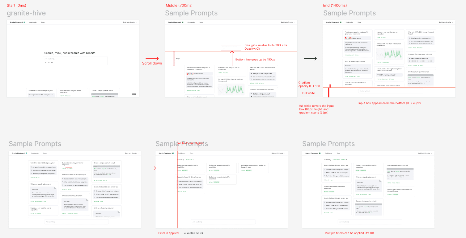
I designed a sample-prompt library for users facing a blank prompt box. Industry hashtags made relevant examples easy to find and tailor for specific customers.
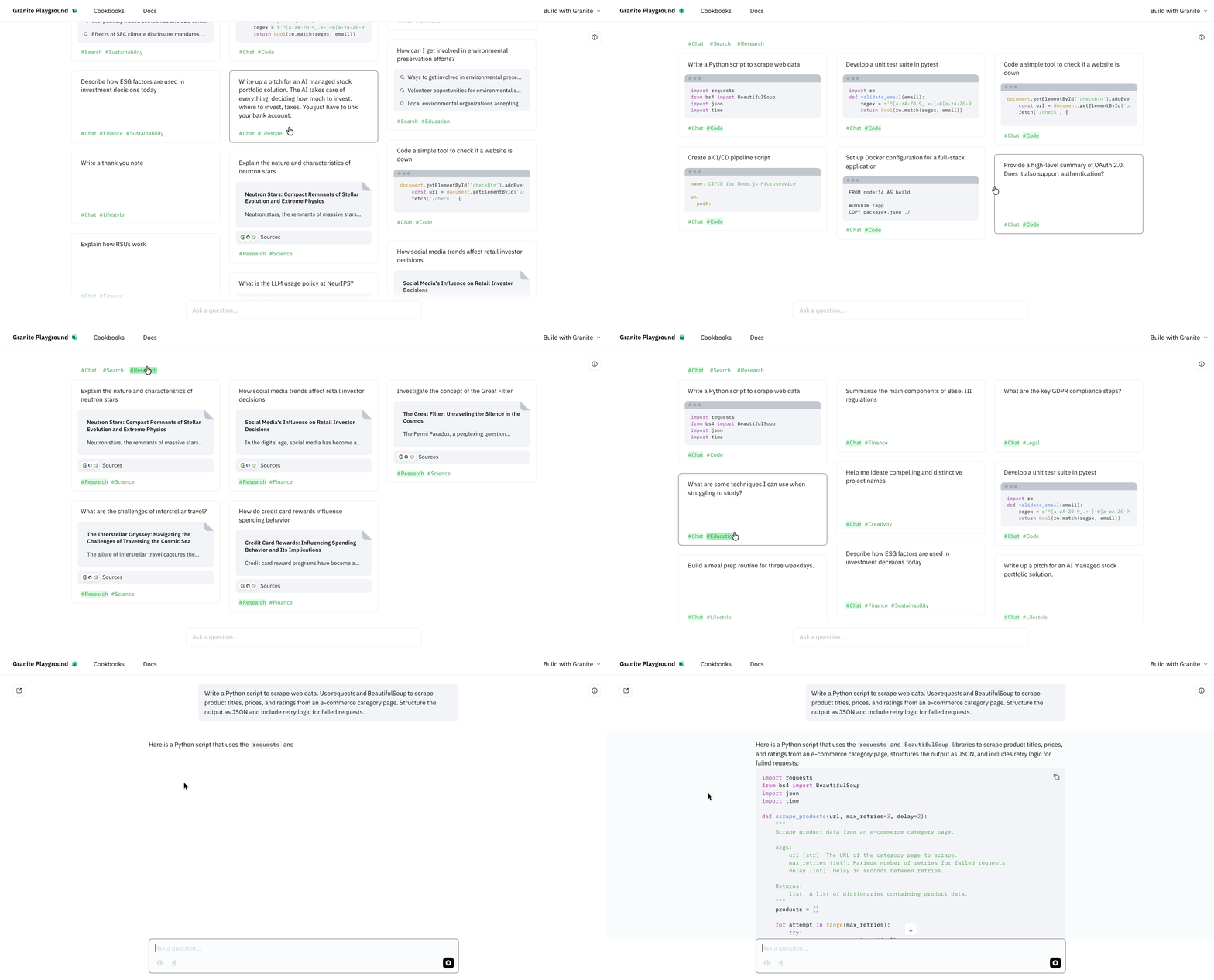
Enterprise-focused prompts
Every prompt reads like real enterprise work, not a generic AI demo, so the first result a visitor sees looks like their own work.
One click, full context
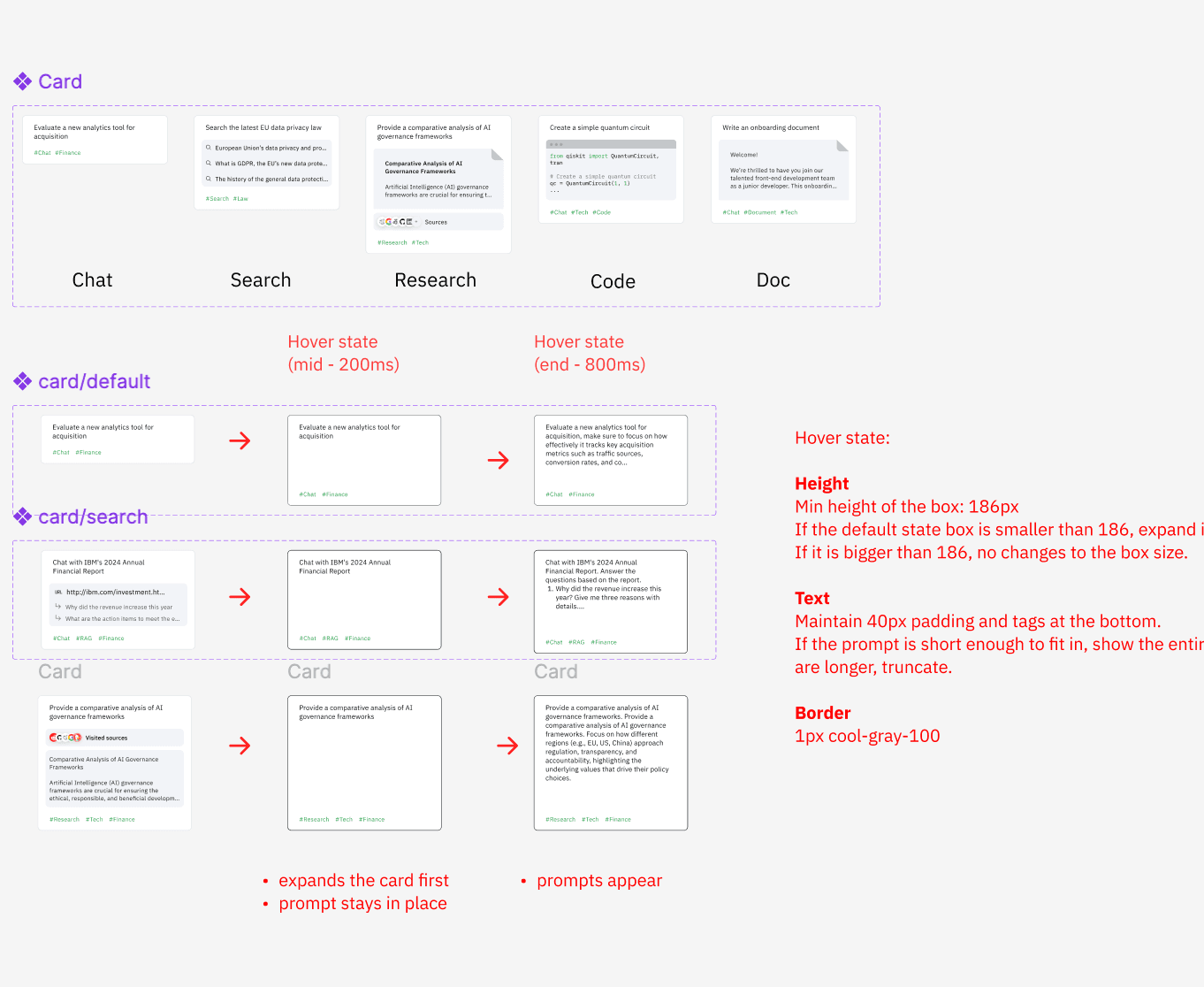
Cards show a short summary, then reveal the full prompt on hover. Users keep context while submitting in one click.
Managed in Airtable
Instead of building an admin page, I used Airtable to store and serve prompts. Non-technical team members could keep the library current without hard-coding changes or redeploying the service.
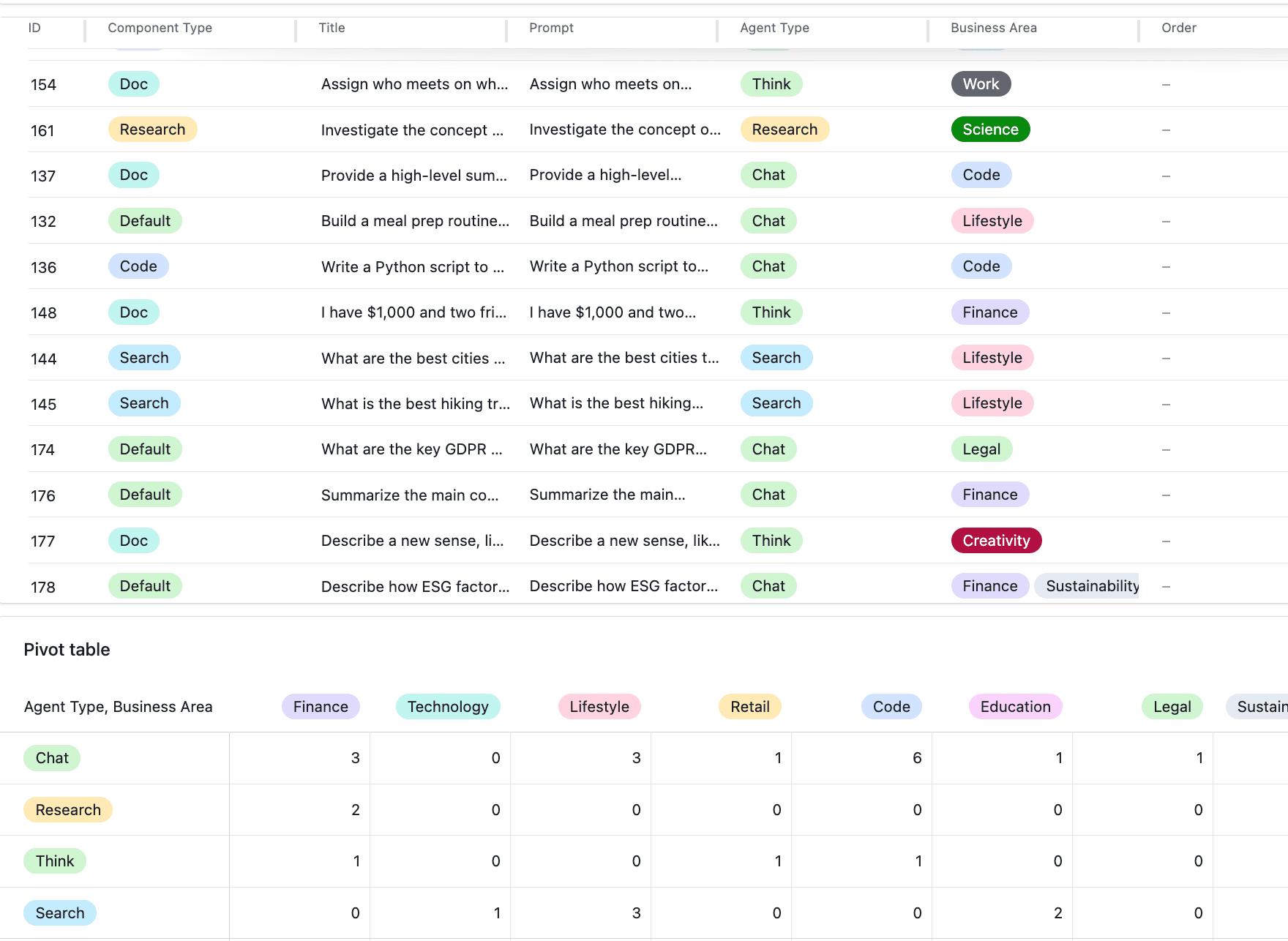
Airtable instead of an admin page
Non-technical team members can add, edit, and recategorize prompts without hard-coding or redeploying.
What do first-time users do when they don't know what to ask an enterprise model?
- Generic prompts create skepticism; industry-specific ones build instant credibility
- Users scan rather than read; a prompt card has to communicate its value before it's clicked
- A blank chat with placeholder suggestions
- Separate role-based onboarding paths
One curated library serves both audiences: industry hashtags help users find relevant prompts, and editable examples let client managers tailor them for customers.
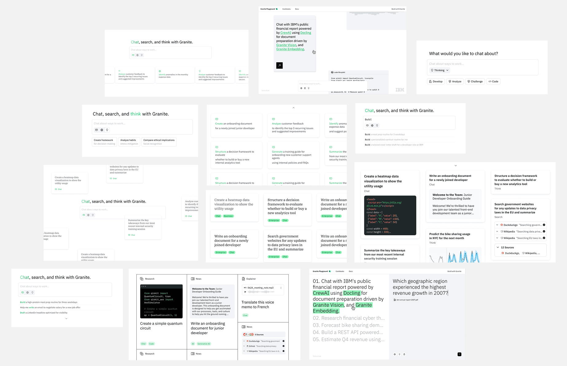
Sample prompt iterations
I explored several ways to help people discover what Granite could do: prompts surrounding the composer, inline suggestions, categorized cards, and examples paired with generated outputs. These iterations clarified what the final experience needed to balance: fast scanning, enough context before launch, and a clear view of Granite's different capabilities.
Designing for Two User Paths
The Playground served both enterprise developers evaluating Granite and IBM client managers demonstrating it to customers. They shared one experience, but needed different paths through it.
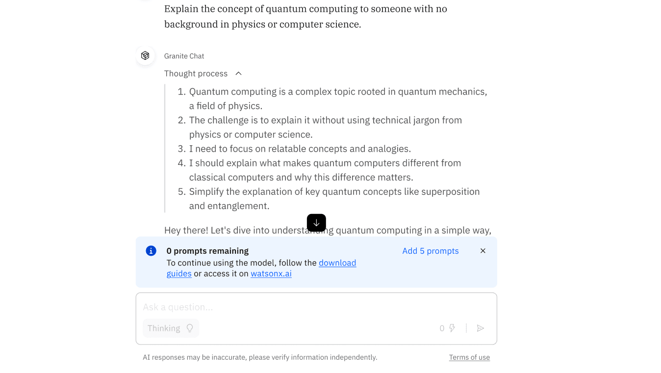
Let developers finish the evaluation
Developers who hit the limit were still evaluating Granite, often before an internal adoption decision. A prominent download prompt interrupted that process.
We made the notice quieter and offered five extra prompts once, with download guides and watsonx.ai as secondary paths. Developers could finish evaluating without removing the usage limit.
Key decisions
Enterprise developers
- Primary users who explored the Playground independently
- Persistent chat box for testing their own prompts
- Direct "Build with Granite," Docs, and Cookbooks CTAs
IBM client managers
- Guided clients through tailored demos and adoption
- Editable prompts for each client's context
- Filtering and search for faster preparation
A Chat Interface Built for Trust
Show the work
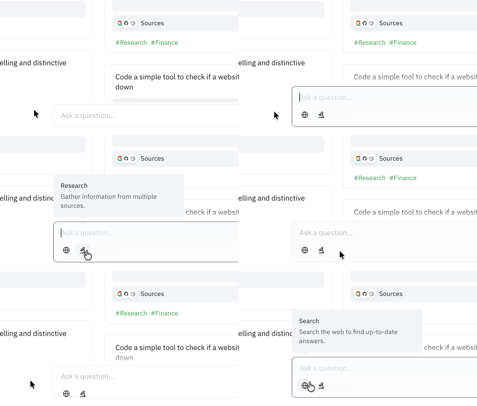
Enterprise evaluation depends on trust, so I designed the chat interface to make the agent's work visible: multi-turn conversations with source citations, a live trajectory showing its plan and sources, and report generation that turns a session into a shareable document.
For developers, that made the output verifiable evidence. For client managers, it created a demo that held up in front of customers.

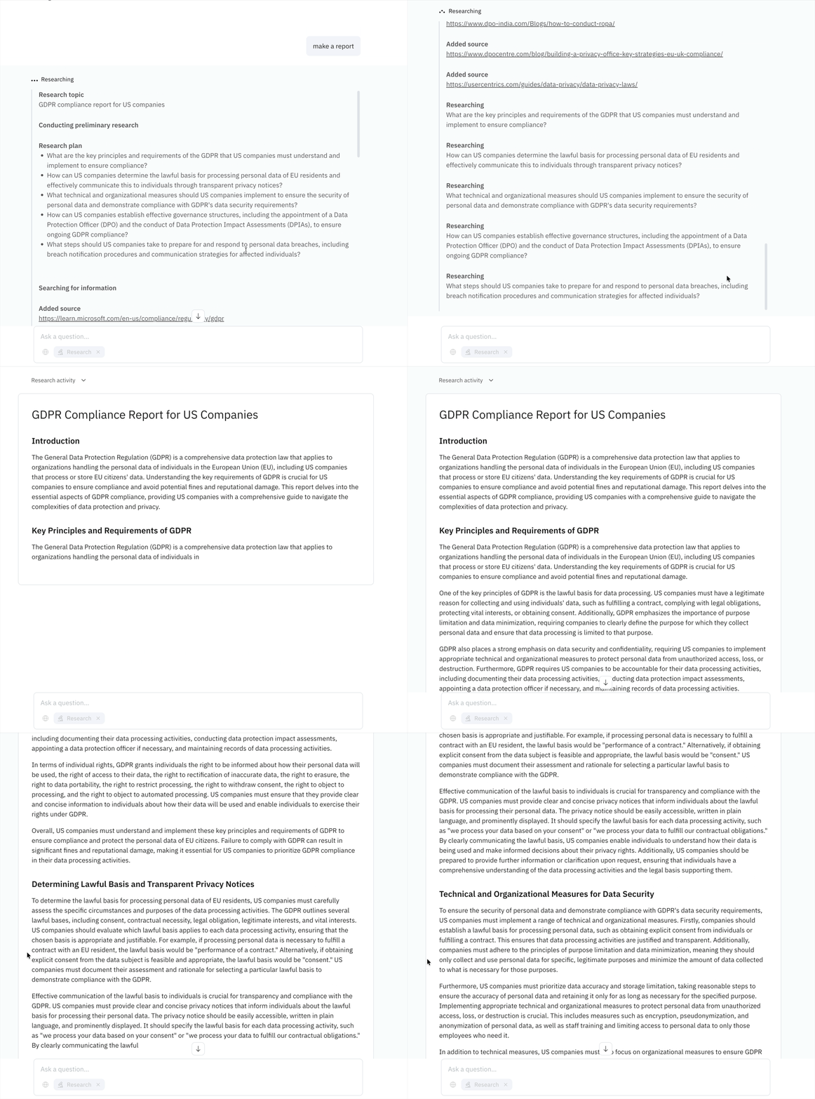
Trajectory, not a spinner
The research agent streams each source as it finds it, so a long run reads as work you can watch instead of a loading state.
Timing matters
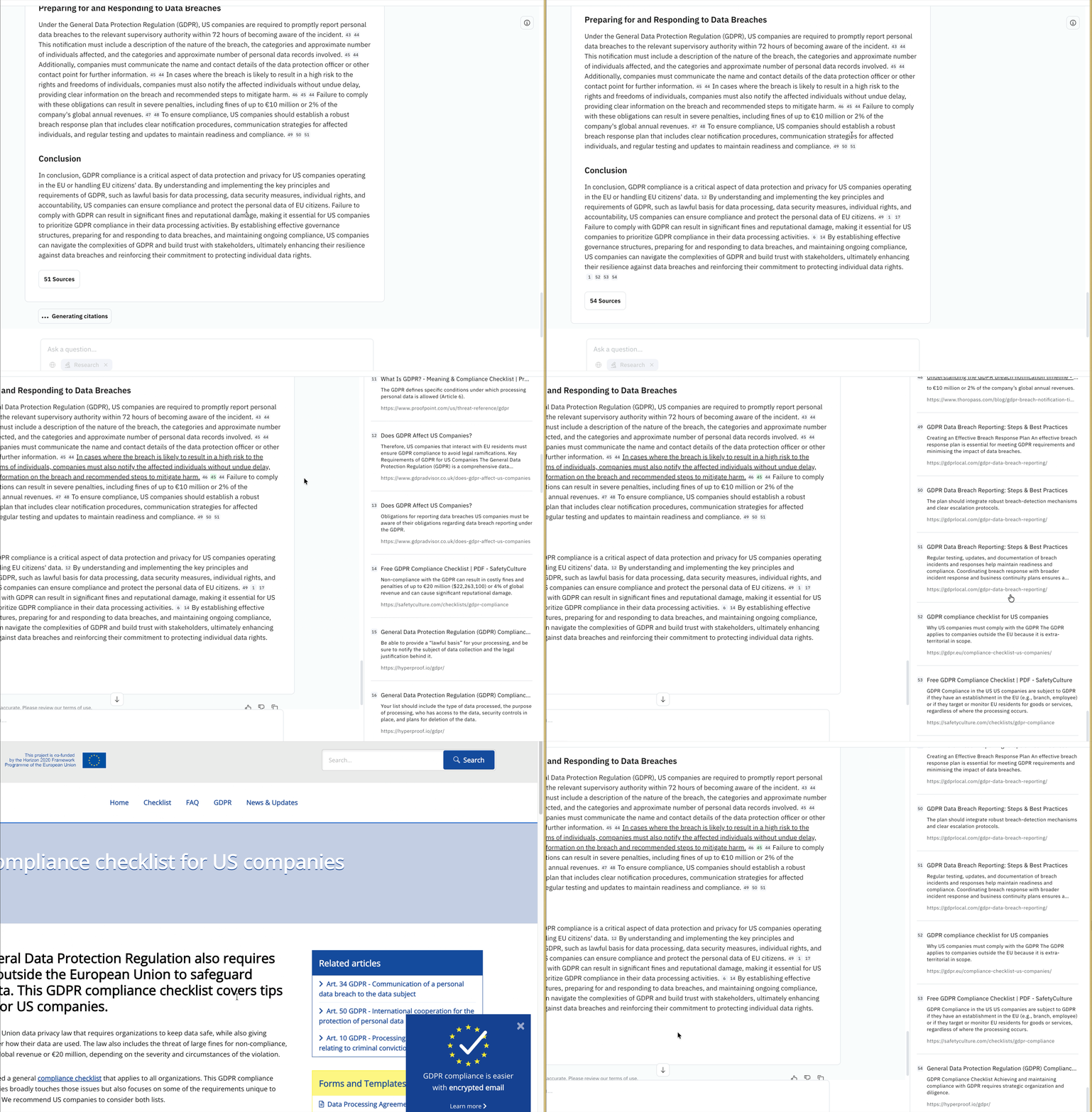
Source retrieval and citation generation continued after inference completed. The answer looked finished even though its evidence was still loading. Some users moved on to their next question without realizing that a citation panel was available.
In the next iteration, I made that timing explicit: the interface communicated that citations were still being generated instead of presenting the response as fully complete.
Citations as evidence
Every answer links back to where it came from, turning output into evidence users can verify rather than text to take on faith.
How do we serve both technical and non-technical users in one interface?
- Transparency in AI interactions builds trust. Users want to understand what's happening
- Users scan rather than read. Key information must be immediately visible and scannable
- Split-screen design with live preview and configuration panels
- Conversational UI prioritizing natural language interaction over structured inputs
Card-based layout with clear visual hierarchy, supports progressive disclosure, familiar patterns, and scales across devices.
Design System & Development Handoff
Design that survives implementation
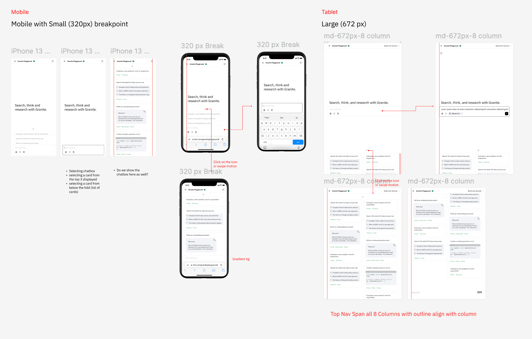
Handed off the playground as a complete design system: a component library, breakpoint specs for every layout, and annotated interaction states, so engineers could build without guessing at intent.
Staying through QA
Handoff wasn't the end of the design work. I stayed embedded through implementation with collaborative QA passes, adapting the design as technical constraints surfaced and refining details against real model behavior, which is why the shipped product matches the design.
Impact
Granite Playground became Granite 4.0's primary activation surface: 2.6× more daily prompts, 3× more unique users, and roughly 30% of Granite web traffic directed to the Playground and Docs.
This stronger evaluation activity contributed to IBM's most successful Granite Day 0 launch.
Learnings
- Journey mapping shifted the entry experience from a blank prompt box to curated enterprise examples.
- Prompt cards evolved to balance one-click speed with enough context to evaluate the full prompt.
- Separating prompt content from the interface through Airtable made the library easier for non-technical teammates to maintain and iterate.
- Showing trajectory and sources gave developers evidence to verify and client managers a story they could confidently demonstrate.
Next steps
- Iterate on the design based on the usage analytics
- Add more agents to the playground